PAUSE LIFE MAGAZINE
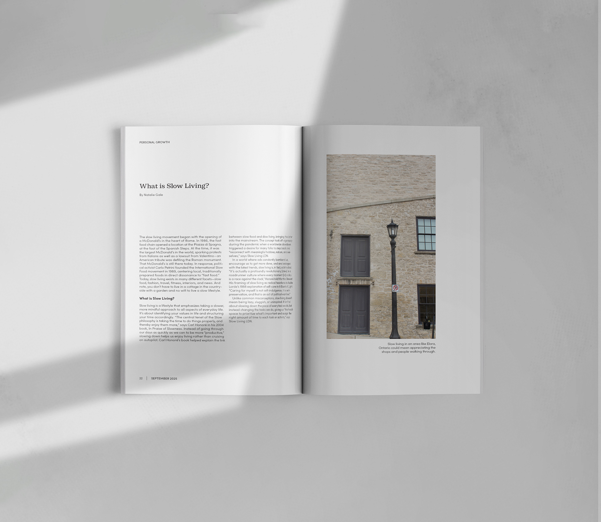
The minimalist lifestyle magazine Pause reminds its audience to hit the “pause button” in their lives every once in a while for their well-being.
The logo uses a clean, weighted sans serif in lowercase letters to represent the approachable and mindful quality of the magazine’s content. The spacing and bullet points in between letters references the need to pause, take a breath, and stay on track. The font in the logo can be paired with a serif to add a level of refinement and professionalism. Soft, muted colours and richer tones represent the brand’s serene characteristics. Its use of colours found in nature suggests a real lifestyle.


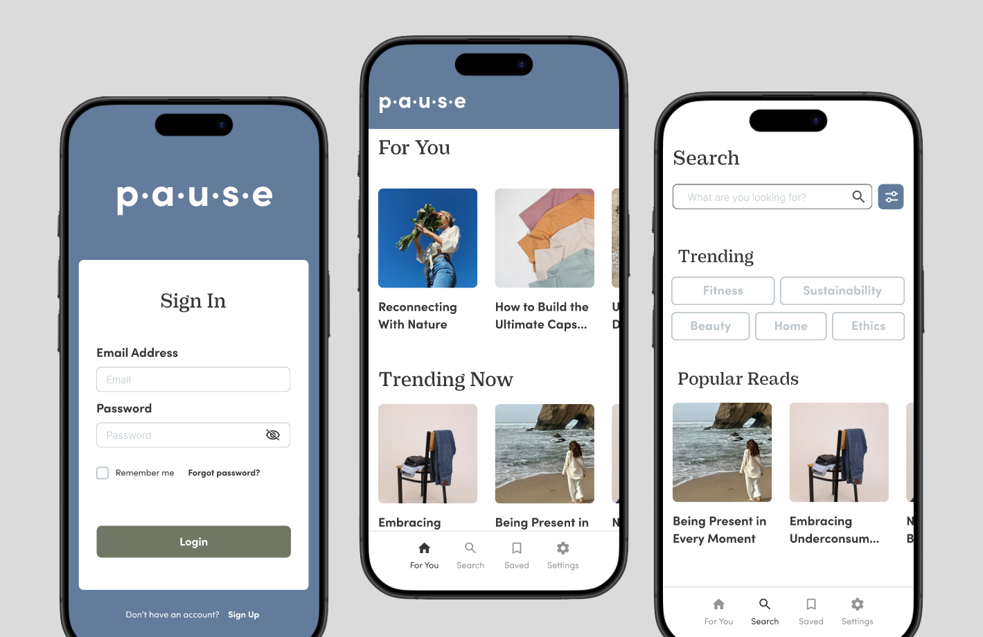
Pause Life Magazine App sign-up process. Prototype made using Figma.
Pause Life Magazine App sign-in and browsing process. Prototype made using Figma.

